Thursday, March 21, 2013

Lab 8: Los Angeles Station Fire


This week’s lab concluded our work with ArcGIS by constructing maps concerning the Station Fire of 2009. Centered in Los Angele’s San Gabriel Mountains, the Station Fire that started on August 26th 2009 quickly became one of southern California’s largest fires in history after it scorched over 160,000 acres of land. Looking to be the work of arson, at one point “the Board of Supervisors of the County of Los Angeles ha[d] established a reward in the amount of $50,000 for any information leading to the apprehension and/or conviction of the person or persons responsible for the heinous actions that lead to a major disaster known as the ‘Station Fire’” (Angeles National Forest). Angeles National Forest’s website points out that fires of such proportion are not really put out for several weeks or months. 

To display the extent of the fires, the first map shows the perimeter of the fires from August 29th to September 1st. Red is for August 29th, yellow for August 30th, orange for August 1st and brown for September 1st. The lime green with orange outline polygon surrounding the fire extent is the Los Angeles National Forest preserve. Because the fire grew so fast and was in areas with unpredictable debris that could contribute to fuel, firefighters had to work fast and for long hours. California Chaparral Institute claims that before the fire, “…there [were] approximately 10,000 acres of fuel treatments and more than 160 miles of fuel breaks within the Station Fire perimeter”. Conflict around how the fires began, spread so fast, or were responded to initiated remarks about federal services and responsibilities, where a rebuttal statement deferred responsibility by saying, “Huge wildfires will occur in Southern California regardless of how the government ‘manages’ its lands…they are an inevitable part of life here.” Some studies have concluded that processes of controlled fire burning within the Station Fire region would not have prevented the outcome of the fire extent. 

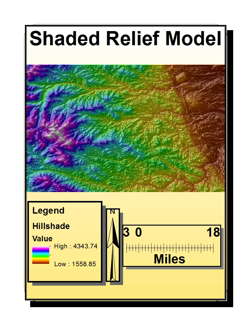
Reports have noted the Station Fire area had not burned for an extended period of time, and that much of the area was within a consistent cycle of fire rotation for wildlands. Richard Halsey said, “the main reason this fire spread as quickly as it did [is that it] had more to do with current long term drought conditions and the steep terrain than the age of the vegetation” (California Chaparral Institute). In my second map, I show a digital elevation diagram (high elevation values are red) and a temperature map (high temperatures in red) based on figures from August 31st. These two diagrams help correlate elevation and temperature parameters of the Station Fire. Immediate observation shows high temperatures in most elevation ranges but slightly lower temps in the highest elevation points. High elevation and emerging winter characteristics helped firefighters combat the fire at high altitudes (Angeles National Forest). When carrying capacities are reached and exceeded, ignition in wildlife settings can occur. This is an effect that happens when through crowded settings and can be likened to having an overloaded grid ignite before a match lights life ablaze (Malamud et.al). 

Seeing how a large portion of Los Angeles and a national forest preservation were destroyed can allow scientists and curious researchers the ability to question how fires spread in unique ways. Richard Rothermal is a practiced environmentalist who has created a mathematical model that predicts spread in wildland fuels. Although Rothermal has contributed significantly to the theory of fire spread, his models lack certain variables such as accelerated debris, spotting, and fire whirls. Eager problem solvers can add to Rothermal’s forty year old prediction model which will hopefully eliminate guesswork during future catastrophic situations. In this way, we may be able to come to a better formed conclusion that challenges ideas that the Station Fire would have occurred regardless of conditions that lead to self-ignition and the spread pattern which happened mostly in a chaparral area. 

In all, the Station Fire of 2009 proved to be a remarkable fire that burned homes, land, and took lives of fire fighters relieving the incident. A fire that started by arson and spread quickly, my first map shows how the Station Fire extends to about 35 percent of the forest outlined and about 10 percent of Los Angeles. My second map relates temperature to elevation showing that except for in the highest elevations, temperature is high and evenly spread. Peaking at 406 degrees, such temperatures show the direct force of the fire itself, shedding insight into how difficult fighting fires really are. Taking into account claims by Malamud et.al where overloaded habitats increase potential for self-ignition and ideas from the California Chaparral Institute that fallowed land in the San Gabriel Mountains was bound to burn based on historic cycles, then we can gather protection of such lands is almost futile as nature would have claimed what humans did not.


Works Cited 

Angeles National Forest. (10 November 2009). Retrieved from http://www.inciweb.org/incident/1856/ 

California Chaparral Institute. “The 2009 Station Fire in the Angeles National Forest”. (4 September 2009). Retrieved from http://www.californiachaparral.com/2009fireinlacounty.html 

Hanes, Ted L. “Succession after Fire in the Chaparral of Southern California.” Ecological Monographs 41.1 (1971): 27-52. JSTOR. Web. 17 March 2013. 

Malamud, Bruce D.; Morein, Gleb; Turcotte, Donald L. “Forest Fires: An Example of Self- Organized Critical Behavior.” Science Journal 281.5384 (1998): 1840-1842. JSTOR. Web. 19 March 2013.

Rothermal, Richard C. “A Mathematical Model For Predicting Fire Spread in Wildland Fuels.” U.S. Department of Agriculture INT-115 (1972): 1-40. JSTOR. Web. 17 March 2013.

Friday, March 1, 2013

Lab 7: Census Distribution Data

This week’s lab consisted of turning census data into visible representations on maps. For this, we downloaded and used data from the United States’ 2000 census found at www.census.gov for Black, Asian, and Some Other Race. Next, we exported statistics from Excel into ArcMap 10.1, adding the governments’ statistics to the base layer of the United States. After manipulating data tables and modifying map symbology by choosing a lighter grey-scale for lower population in percent and a dark grey-scale for high populations in percent, the contrast between layers fluidly portrayed our data. As a result we were able to visually convey the spatial-distribution of those numbers.


For the distribution of people in the 2000 census, we see a heavy concentration of Blacks in the southeastern U.S. spanning from Texas eastward to northern Florida all the way up to New York. The central west coast and small areas in the central United States like Michigan and Chicago, significantly house more Black people than central and northwestern United States. Seeing how the concentration of Black people is located on the southeastern portion of the country, we can assume historical factors such as slavery and immigration have played a role in dictating their location. Taking into consideration history and contemporary statistics from 2011 which says the total Black population in the U.S is 13.1% (www.census.gov), we can see a fanning spread of Black folks across the country especially in California and Nevada.


Asian populations are found predominately on coastal regions on the west coast. High populations are also centered on the east coast of the United States with strong concentrations in Alaska and Hawaii. Throughout the central U.S, small clusters of Asians are visible, but great distances between proximal locations are the trend eastward and westward, while a north to south line can be seen. Historical factors of immigration contributes to the location of the majority of the Asian population. 2011 population statistics claim the total Asian population is 5.1% (www.census.gov), and like the Black population, is also underrepresented in total numbers in several areas.


Some other race alone statistics are much stronger on the west coast and central U.S than previous map diagrams. People on census forms are allowed to claim an “other” racial category, possibly skewing numbers that could add to Black or Asian representation. California, Texas, New Mexico and Colorado contain a large population of people claiming this category. Census forms are subjectively created, so speculation can only abound as to the reasons why persons choose to be independent of given racial categories.

Further exploration of population statistics over time can give us insight into why people choose to move the way they do. GIS allows us to visually represent these trends and manage data. If we begin to ask questions, analyze evident statistics, and explore possible answers, our portrayal of data becomes more meaningful. With the analytic tools GIS offers, answers to questions we pose can contain powerful socio-political ramifications. Thus, it becomes imperative that we use GIS to our full capabilities, asking more questions when we can.


Friday, February 22, 2013

Lab 6: Digital Elevation Models in ArcGIS


3-Dimensional Representations of Surface Area


---------------------------------------------------------------------------------


This week’s lab consisted of creating four digital elevation models (DEM) in ArcGIS. The four model types are: shaded relief, slope layer, aspect layer, and 3-Dimensional surface area. What seems to be a mountain range located in the southeastern United States has an area and extent range that covers from: top:: 39.8291666661 degrees; bottom:: 39.3838888883 degrees; left:: -105.788888889 degrees; and right:: -104.969444445 degrees. For this data set, the GCS North American 1983 defines the coordinate system being used.


 Creating 3-D models and exploring the analytic capabilities of ArcGIS is excellent for seeing models in different ways. For example, in ArcScene one can use the flying option to navigate through the projected 3-D model to achieve angles not ordinarily possible by mouse manipulation. With such options, one model can begin to look new in many ways as each analytic tool presents new perspectives and discoveries through stored data found within the layers.


Wednesday, February 20, 2013

Lab 5: ArcGIS Projection


       All map projections experience distortion to an extent which may or may not be acceptable for certain applications. In this week's lab we used ArcGIS to create our own maps using Equal Area, Equidistant, and Conformal  projection forms. We defined two cities, Washington D.C. (W.D.C), and Kabul, and then measured the distance between both locations in each map-projection. By using different projection techniques, it became possible to see the relationships different map projections have to one another when comparing map-scale properties. Each projection type has pros and cons, and understanding a few basic concepts around how data is distorted can lead to choosing better maps. Scale representation is easily manipulated by changing data inputs, thus it becomes integral to have accurate definitions when representing data.

In the first series of maps I used sinusoidal and cylindrical projections to show equal area properties. Equal area maps allow the earth's masses to preserve areas equal to their true areas on Earth. The sinusoidal projection is also known as a pseudocylindrical projection because of the way it distorts shape. This type of distortion is deceiving to the eye when considering equal area properties yet remains mathematically proportional despite any perceived illusions. The cylindrical equal area map has a lot of distortion near the poles. Due to this, some studies should use other projections types to answer questions. The distance from W.D.C to Kabul is 8,097 miles and 10,130 miles--sinusoidal and cylindrical projections respectively.

On the other hand, equidistant projections preserve distance between a set or sets of points where distances over the map will match true distances on earth. For my equidistant representations I used two-point equidistant and equidistant conical projections. What can be noticed are the unique angles each map features. Because the distance between a set of points is preserved on equidistant maps, they can prove to be beneficial to individuals looking to define time as a value when navigating between places. One can notice many distortions about the equidistant maps I used in their use of shaping continents and angles. The distance from W.D.C to Kabul is 6,640 miles and 7,000 miles--two-point equidistant and equidistant conical projections respectively.

Last of the maps are conformal projections which preserve shapes locally. Through this, conformal maps preserve shapes of land masses and the visual familiarity most people have with maps. I chose to use Miller Cylindrical and Mercator projections for my conformal maps. The popularity of these maps makes them important in relaying conceptual information. It should be noted that inaccuracy of quantitative values makes this map less useful when calculating data or using numbers to represent accurate information. Regardless of the errors found within such maps they are important in education and theory where abstract concepts can be relayed through visual data and less on numbers. The distance from W.D.C to Kabul is 10,203 miles and 10,098 miles--Miller Cylindrical and Mercator projections respectively. By completing this lab I have gained a better understanding of map projections and the various types of representations that exist to relay spatial information that defines the earth.


Thursday, February 14, 2013

Lab 4: Intro to ArcMap

This week’s lab consisted of making an expose of maps that outlines potential modifications to an airport. Construction within such a landmark requires surveys beyond its immediate boundaries that consider noise levels that will potentially concern residents of the community. As such, schools in proximate area also consider impacts of airport expansion. A guideline for noise regulations is set at 65 decibels, expressed over 24 hour frames. If consistent noise above 65 decibels takes place in a 24 hour period, measures to combat such high levels must be taken into consideration by residents and community officials. It is interesting to see the dialectical relationship expressed in construction efforts that occurs when a sector of the community decides to build something. Fortunately, programs such as ArcGIS are able to digitally represent the social statistics that can be collected though questions and answers.

This lab was guided by a detailed outline of instructions that walked one through the process of measuring noise contour levels, population, and area statistics and implementing them into a presentable form that details all the statistics. Several layers were used in conjunction to compose the maps which allow a lot of information and detail to be embedded into the maps. Overlaying the maps is a difficult but rewarding process as important questions regarding social concerns can be addressed through a visual aid such as ArcGIS. In making the maps presentable, it is possible for the user to modify the environmental symbols that index buildings, schools, roads, scale bars, ect…Extensive functions exist within the program that can exhibit user goals.
The vast system that is ArcGIS proves useful in communicating feedback to the user when positive inputs are correctly output. There is a steep learning curve to the program that takes patience, repetition, and time, but on the same token is greatly rewarded through powers of exhibition. Map language is crucial to relaying knowledge, and the ability to greater manipulate that knowledge means more efficient maps and a better informed body of people. The ArcGIS program has a few modes the user can interface with, such as landscape and data modes, where users are quickly able to toggle between settings and progressive layers. Each mode is used differently, but the end results are the same when finally integrating all statistical information. In this way, the ArcGIS program proved beneficial in seeing which community members would be most impacted by airport modifications and noise levels.
By the end of the tutorial I gained a sense of how the ArcGIS system works in communicating to people. Importantly in the program is the ability to make distinctions, and the array of color schemes to choose from makes understanding the final results intuitive and easy to follow. I have yet to fully explore the capabilities of this system but know that new things will be learned along the way. I also learned that it pays off to be accurate in representation not only visually, but statistically and ethically because the consequences of misrepresentation can be dire to unsuspecting individuals.


Friday, January 25, 2013

Lab 3: Neography Map Mash-Up

Using Google Maps (GM) to create my own map was a delighting experience as I was able to  “… us[e] and creat[e] [my] own map, on [my] own terms…by combining elements of an existing toolset” (Turner). I became familiar enough to eventually create a substantive map that coveys information, knowledge, and understanding… using social statistics and location to synchronize data. I quickly took enjoyment (and became slightly addicted) in being able to manipulate data not for myself, but for the viewer who would be interacting with my map. 

It quickly became important to have an idea to illustrate through my map because maps without thought and/or content are void of real connection. Through “shaping context”, I was able to connect information across and through several fields such as: economics, geography, anthropology and sociology. In this map you will find the top 20 most dangerous cities in the world, based on homicide statistics (information is provided by BusinessInsider.com and is sourced through The Citizens' Council for Public Security and Criminal Justice),the world’s 20 poorest countries (information provided by Foxbusiness.com and therichest.org, sourced through the 24/7 Wall Street and the International Monetary Fund, respectively), the world’s ten best places to live (information provided and sourced by Forbes.com ), and the world’s richest cities (information provided by known.pk and is sourced from Mercer Consulting). 

Although choosing sources to become data of illustration is difficult and arbitrary when documenting social statistics and ranking them, consistencies within data paradigms were sought and targeted as viable sources. Questions concerning how studies were conducted and what kind of stringent methodologies were used can shed light onto the verifiability of data. Regardless, information provided is rich with detail and statistics that tell a story of a socially stratified world. Although not surprising, making such statistics visible is much more emotional.

Over the course of creating my map on Google, I did run into some beginning difficulties concerning program familiarities that were easily overcome. Repeatedly interfacing with the GM program made navigating, designing, and incorporating my ideas easier over time. Through the course website, useful links to expand map building information was provided, which guides one through several different applicable Html source codes and pitfalls associated with them.

 I was able to see how the GM program has abilities that can be unlocked by advanced programmers who understand coded language. As every individual has different computer skills, maps can only be created to the extent of knowledge one possesses, and I quickly knew the extent of my skills as some of the advanced features were found to be unavailable to my GM creation skill set. As mentioned before, I was able to learn a lot and found some beginner tricks readily available to me, so I tried to include what I learned into the overall ergonomics of my map. I think neogeography on the whole has unlimited potential especially as other widely and easily distributed map making programs become open for people to use. Until then, people will be limited in software choices…which will unavoidably bring a lot of frustration to the user as well as growth in skill over time.

+++


Above map illustrates socio-economic points previously mentioned. The (!) symbolizes the world's most dangerous cities while the (P) symbolizes the world's poorest countries. All ($) symbols refer to the world's richest cities, while the house([^]) symbol refers to the world's best places to live.

+++


 Above map illustrates the northern hemispheres'stark socio-economic advantage over the southern hemisphere.

+++


 Above map illustrates the southern hemispheres'stark socio-economic inequalities over the northern hemisphere.

+++

Thursday, January 24, 2013

Lab 2: Beverly Hills Map Dialogue


* What is the name of the quadrangle?

The name of the quadrangle is “Beverly Hills”, which is located in Los Angeles, California.

* What are the names of adjacent quadrangles?
1. Canoga Park           4. Topanga                  7. Venice
2. Van Nuys                5. Hollywood              8. Inglewood
3. Burbank                  6. Beverly Hills

* When was the quadrangle first created?

The map topography was compiled in 1966 and the Beverly Hills map was created in 1995.

* What datum was used to create your map?

The National Geodetic Vertical Datum of 1929, North American Datum 1927 (NAD 27), and NAD 83 information was used to create the Beverly Hills Quadrangle.

* What is the scale of the map?

The map is a 7.5 min map, and the scale is 1:24,000…represented in inches.

* At the above scale, answer the following:

a) 5 centimeters on the map is equivalent to how many meters on the ground?

5 centimeters on the map equals 1200 meters on the ground.

b) 5 inches on the map is equivalent to how many miles on the ground?

5 inches on the map is equal to 1.89 miles in the ground.

c) one mile on the ground is equivalent to how many inches on the map?

1 mile on the ground is equivalent to 2.64 inches on the map.

d) three kilometers on the ground is equivalent to how many centimeters on the map?

3 kilometers on the ground is equal to 12.5 centimeters on the map.

* What is the contour interval on your map?

The contour interval on the map is 20 feet.

*What are the approximate geographic coordinates in both degrees/minutes/seconds and decimal degrees of:

1.      the Public Affairs Building

34 deg 4’22” N, -118 deg 26’24’’ W
Or
34.073 N, -118.440 W

2.      the tip of Santa Monica pier

34 deg 0' 27" N, -118 deg 28' 60" W
Or
34.01 deg N, -118.5 deg W

3.      the Upper Franklin Canyon Reservoir

34 deg 5' 53" N, -118 deg 24' 43.25" W
Or
34.1 deg N, -118.41 deg W
 
* What is the approximate elevation in both feet and meters of:

a)      Greystone Mansion (in Greystone Park);

550 feet or 167.68 meters

b)      Woodlawn Cemetery;

140 feet or 42.6 meters

c)      Crestwood Hills Park;

800 feet or 243.90 meters

* What is the UTM zone of the map?

The UTM zone of the Beverly Hills map is zone 11.

* What are the UTM coordinates for the lower left corner of your map?

The UTM coordinates on the map are 362000m E, 3763000m N.

* How many square meters are contained within each cell (square) of the UTM gridlines?

There are 1 million square meters contained within each square of the UTM gridlines.

* Obtain elevation measurements, from west to east along the UTM northing 3771000, where the eastings of the UTM grid intersect the northing. Create an elevation profile using these measurements in Excel (hint: create a line chart). Figure out how to label the elevation values to the two measurements on campus. Insert your elevation profile as a graphic in your blog.


* What is the magnetic declination of the map?

The magnetic declination of the map is 14 deg East.


* In which direction does water flow in the intermittent stream between the 405 freeway and Stone Canyon Reservoir?

The water from the Stone Canyon Reservoir flows Southward from the North.
* Crop UCLA Map