Friday, February 22, 2013

Lab 6: Digital Elevation Models in ArcGIS


3-Dimensional Representations of Surface Area


---------------------------------------------------------------------------------


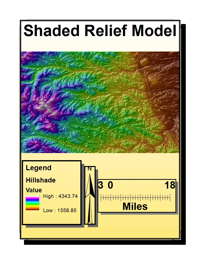
This week’s lab consisted of creating four digital elevation models (DEM) in ArcGIS. The four model types are: shaded relief, slope layer, aspect layer, and 3-Dimensional surface area. What seems to be a mountain range located in the southeastern United States has an area and extent range that covers from: top:: 39.8291666661 degrees; bottom:: 39.3838888883 degrees; left:: -105.788888889 degrees; and right:: -104.969444445 degrees. For this data set, the GCS North American 1983 defines the coordinate system being used.


 Creating 3-D models and exploring the analytic capabilities of ArcGIS is excellent for seeing models in different ways. For example, in ArcScene one can use the flying option to navigate through the projected 3-D model to achieve angles not ordinarily possible by mouse manipulation. With such options, one model can begin to look new in many ways as each analytic tool presents new perspectives and discoveries through stored data found within the layers.


Wednesday, February 20, 2013

Lab 5: ArcGIS Projection


       All map projections experience distortion to an extent which may or may not be acceptable for certain applications. In this week's lab we used ArcGIS to create our own maps using Equal Area, Equidistant, and Conformal  projection forms. We defined two cities, Washington D.C. (W.D.C), and Kabul, and then measured the distance between both locations in each map-projection. By using different projection techniques, it became possible to see the relationships different map projections have to one another when comparing map-scale properties. Each projection type has pros and cons, and understanding a few basic concepts around how data is distorted can lead to choosing better maps. Scale representation is easily manipulated by changing data inputs, thus it becomes integral to have accurate definitions when representing data.

In the first series of maps I used sinusoidal and cylindrical projections to show equal area properties. Equal area maps allow the earth's masses to preserve areas equal to their true areas on Earth. The sinusoidal projection is also known as a pseudocylindrical projection because of the way it distorts shape. This type of distortion is deceiving to the eye when considering equal area properties yet remains mathematically proportional despite any perceived illusions. The cylindrical equal area map has a lot of distortion near the poles. Due to this, some studies should use other projections types to answer questions. The distance from W.D.C to Kabul is 8,097 miles and 10,130 miles--sinusoidal and cylindrical projections respectively.

On the other hand, equidistant projections preserve distance between a set or sets of points where distances over the map will match true distances on earth. For my equidistant representations I used two-point equidistant and equidistant conical projections. What can be noticed are the unique angles each map features. Because the distance between a set of points is preserved on equidistant maps, they can prove to be beneficial to individuals looking to define time as a value when navigating between places. One can notice many distortions about the equidistant maps I used in their use of shaping continents and angles. The distance from W.D.C to Kabul is 6,640 miles and 7,000 miles--two-point equidistant and equidistant conical projections respectively.

Last of the maps are conformal projections which preserve shapes locally. Through this, conformal maps preserve shapes of land masses and the visual familiarity most people have with maps. I chose to use Miller Cylindrical and Mercator projections for my conformal maps. The popularity of these maps makes them important in relaying conceptual information. It should be noted that inaccuracy of quantitative values makes this map less useful when calculating data or using numbers to represent accurate information. Regardless of the errors found within such maps they are important in education and theory where abstract concepts can be relayed through visual data and less on numbers. The distance from W.D.C to Kabul is 10,203 miles and 10,098 miles--Miller Cylindrical and Mercator projections respectively. By completing this lab I have gained a better understanding of map projections and the various types of representations that exist to relay spatial information that defines the earth.


Thursday, February 14, 2013

Lab 4: Intro to ArcMap

This week’s lab consisted of making an expose of maps that outlines potential modifications to an airport. Construction within such a landmark requires surveys beyond its immediate boundaries that consider noise levels that will potentially concern residents of the community. As such, schools in proximate area also consider impacts of airport expansion. A guideline for noise regulations is set at 65 decibels, expressed over 24 hour frames. If consistent noise above 65 decibels takes place in a 24 hour period, measures to combat such high levels must be taken into consideration by residents and community officials. It is interesting to see the dialectical relationship expressed in construction efforts that occurs when a sector of the community decides to build something. Fortunately, programs such as ArcGIS are able to digitally represent the social statistics that can be collected though questions and answers.

This lab was guided by a detailed outline of instructions that walked one through the process of measuring noise contour levels, population, and area statistics and implementing them into a presentable form that details all the statistics. Several layers were used in conjunction to compose the maps which allow a lot of information and detail to be embedded into the maps. Overlaying the maps is a difficult but rewarding process as important questions regarding social concerns can be addressed through a visual aid such as ArcGIS. In making the maps presentable, it is possible for the user to modify the environmental symbols that index buildings, schools, roads, scale bars, ect…Extensive functions exist within the program that can exhibit user goals.
The vast system that is ArcGIS proves useful in communicating feedback to the user when positive inputs are correctly output. There is a steep learning curve to the program that takes patience, repetition, and time, but on the same token is greatly rewarded through powers of exhibition. Map language is crucial to relaying knowledge, and the ability to greater manipulate that knowledge means more efficient maps and a better informed body of people. The ArcGIS program has a few modes the user can interface with, such as landscape and data modes, where users are quickly able to toggle between settings and progressive layers. Each mode is used differently, but the end results are the same when finally integrating all statistical information. In this way, the ArcGIS program proved beneficial in seeing which community members would be most impacted by airport modifications and noise levels.
By the end of the tutorial I gained a sense of how the ArcGIS system works in communicating to people. Importantly in the program is the ability to make distinctions, and the array of color schemes to choose from makes understanding the final results intuitive and easy to follow. I have yet to fully explore the capabilities of this system but know that new things will be learned along the way. I also learned that it pays off to be accurate in representation not only visually, but statistically and ethically because the consequences of misrepresentation can be dire to unsuspecting individuals.