Map 1: Mapping Ethnic Stereotypes
Mapping Ethnic Stereotypes Link

+
+
+
This world map capturing ethnic stereotypes is sourced from Professor Catherine Lavender's "The Peopling of NYC ... honors college seminar webpage." Lavender teaches at Staten Island's City University of New York, and her website is complete with a publicly available syllabus and course readings.
Such a derogatory map is interesting because it portrays a world map divided by stereotypes. In this portrait, normal country boundaries are shrunk and expanded to enhance such stereotypes. Maps like this one encourage demoralizing and judgmental behavior that have negative socio-cultural ramifications, often aiding in marginalizing groups of people. Beyond the stereotypical "historization" of groups of people lies cultural racism and deeply embedded ignorance that many accusers cannot intelligently justify. Despite this, it seems professor Lavender was using this map in her class as a way to educate her students about the preconceived notions immigrants face when arriving in new countries.
+
+
A response concerning the creation of maps made by indigenous Native American First Nations can be found here.
+
+
+
--
+
+
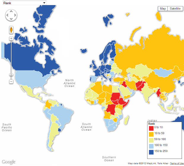
Map 2: Peoples Under Threat Around the World
+
+
Presented by "The Guardian Data Blog", this Peoples Under Threat map clearly distinguishes what areas of the world have indigenous populations under severe threat. In fact, half of the top ten most in danger countries are in Africa, with Sudan being number one on the list! On the Guardian website, the map is completely interactive and allows one to entertain facts from locations all over the world.
This Peoples Under threat Around the World map ranks countries from 0 to 250 and divides the rankings into five categories of threat, red representing the countries in most danger. Six of the most at risk locations are in Africa, while three are in the Middle East, and one in Asia. If a country is represented by light blue or blue, it ranks among the safest 150 countries and have are under no imminent threat. It is clear that the majority of the Western hemisphere is under no threat, unlike the Eastern portion where many societies are in danger. It would be interesting to see how this map evolves over time as societies are eliminated from the Earth.
+
+
+
--
+
+
+
Map 3: Mesoamerican Languages
Mesoamerican Language map link

+
+
+
At first when noticing this Mesoamerican language map distributed on Wikipedia, the immediate thought that comes to mind is how convoluted it can look. This map represents language variety in the Mesoamerican sphere where the Mayan and Oto-Manguean languages are the majority.
Ten Mesoamerican and ancient civilization languages are represented, spread over a small area of Central and Southern Mexico. I found this map interesting because in my beginning studies of Mesoamerica, much is said about the many different languages found. More so than simply representing language variety, this map represents varying cultures in the region as well. Several ethnicities are represented through the languages presented, and can thus draw other logical conclusions. This map is a lot to look at, but it allows the viewer the ability to break down culture contact and its spreading influence.
+
+
+
No comments:
Post a Comment